When Dark Mode Is More Than a Trend and the Psychology Behind UI Choices

Dark mode UI design has evolved from a stylistic option into a meaningful design philosophy. Across Singapore, businesses and designers are exploring how this visual shift affects not only aesthetics but also user emotions and interactions. The rise of dark mode represents more than a reaction to modern trends—it signifies a deeper understanding of how people engage with digital environments.
As users spend longer hours on screens, they naturally gravitate towards interfaces that offer comfort and reduce visual strain. Designers, in turn, are leveraging colour psychology, contrast, and usability principles to enhance focus and create immersive experiences. Whether on mobile apps, e-commerce platforms, or business dashboards, dark mode’s psychological influence is becoming increasingly apparent. Consequently, studying its growing relevance helps uncover how design choices shape perception, emotion, and user satisfaction across Singapore’s fast-evolving digital ecosystem.
Is Dark Mode UI Design Popular in Singapore?
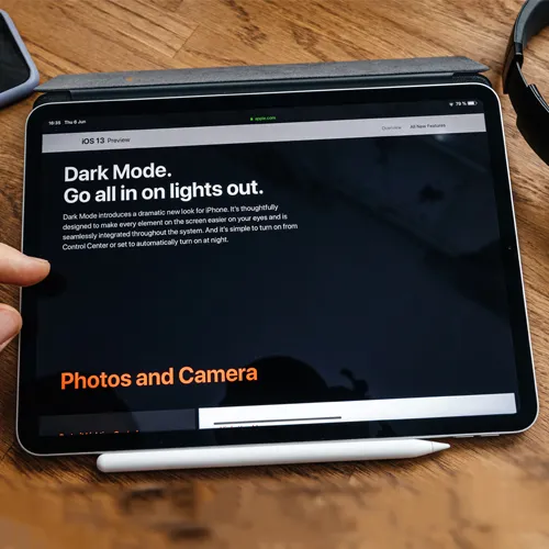
Is the dark mode a growing preference or just a passing choice? In recent years, dark mode UI design has emerged as a distinctive visual trend across websites and mobile applications in Singapore. Although some may consider it a mere aesthetic choice, its growing implementation suggests a deeper connection to user behaviour and digital comfort. Many Singaporean users appreciate how dark interfaces reduce glare and eye strain, especially during extended use at night. This preference aligns with the nation’s highly mobile and tech-savvy population, where long hours on screens are common.
However, popularity does not necessarily mean universal adoption. While digital-first brands, fintech platforms, and creative agencies in Singapore often embrace dark mode for its sleek and modern feel, others remain cautious. Government portals, educational sites, and traditional corporations still rely heavily on light themes to maintain accessibility and neutrality. This contrast reflects how dark mode UI design is not yet a default choice but a selective adaptation based on brand identity and audience expectations.
Moreover, the rising awareness of user experience psychology continues to influence UI decisions. Designers now consider how colour schemes affect emotions and usability. As Singapore’s digital ecosystem evolves, dark mode may transition from being a stylistic experiment to a core design standard — not because it looks trendy, but because it resonates with how people interact, focus, and feel in digital spaces.
Why Is Dark Mode UI Design More Than a Trend in Singapore?
Certain factors drive the continued adoption of dark mode UI design. The appeal of dark mode UI design in Singapore extends well beyond visual fashion. It reflects a conscious shift toward user-centric thinking, where comfort, accessibility, and sustainability guide interface decisions.
As users spend increasing hours on digital devices, designers have recognised the need to reduce visual fatigue and maintain engagement. Dark interfaces help achieve this by lowering brightness levels, minimising eye strain, and creating a calmer viewing experience, especially in dimly lit environments.
Furthermore, the practicality of dark mode supports Singapore’s emphasis on energy efficiency and eco-friendly digital solutions. OLED and AMOLED screens consume less power when displaying darker tones, aligning with the city-state’s broader sustainability goals. This subtle but meaningful advantage makes dark mode UI design both functional and responsible.
Equally significant is the emotional and psychological dimension. Dark themes often evoke sophistication, exclusivity, and focus—qualities that resonate strongly with premium brands and fintech startups in Singapore. The colour contrast naturally draws attention to key content, improving readability and enhancing the overall perception of depth.
In addition, the adoption of dark mode across global platforms like WhatsApp, Instagram, and YouTube has influenced local expectations. Users now perceive dark interfaces as modern and professional rather than experimental. As a result, Singaporean designers view dark mode not as a fleeting web design fad but as an essential evolution shaped by usability, brand psychology, and conscious digital living.
The Psychology Behind UI Choices
Emotions, perception, and behaviour often shape UI design decisions. Every effective interface design reflects an understanding of human psychology. The way users perceive colours, shapes, and layouts influences how they interact with digital environments. UI design is not just about visual appeal; it is about guiding attention, triggering emotions, and building trust.
When a user lands on a website or app, their subconscious immediately begins assessing its usability and credibility. This instant impression often determines whether they stay or leave. Designers, therefore, rely on psychological principles such as visual hierarchy, cognitive load, and colour theory to create balanced and intuitive experiences.
Warm colours may stimulate energy or urgency, while cool tones foster calmness and trust. Rounded buttons appear friendlier, whereas sharp edges convey precision and authority. These subtle cues help users navigate interfaces with minimal effort, reducing frustration and enhancing satisfaction.
Moreover, familiarity plays a crucial role. When UI elements align with common user expectations—like predictable navigation bars or consistent icon styles—people feel more comfortable and confident. This sense of control directly affects engagement and conversion rates.
Ultimately, thoughtful UI design merges psychology and functionality. By understanding how people think, feel, and respond, designers can craft experiences that feel effortless and emotionally satisfying. In Singapore’s competitive digital space, this psychological insight allows brands to differentiate themselves not through decoration but through meaningful, human-centred interaction.
The Psychology Behind the Dark Mode UI Design Choices
The psychology behind dark mode UI design reveals much more than aesthetic preference. It stems from how humans respond to light, contrast, and emotional tone in visual environments. Dark interfaces naturally create a sense of depth and focus, allowing the mind to concentrate on essential content while filtering out distractions. This effect explains why users often describe dark mode as more immersive and comfortable during extended screen use.
Emotionally, darker tones convey sophistication, mystery, and authority. They evoke feelings of control and modernity, which appeal strongly to tech-savvy and design-conscious users in Singapore. Brands leveraging dark mode often aim to project exclusivity or a futuristic identity, resonating with audiences who associate dark interfaces with innovation and premium quality.
From a cognitive perspective, the reduced brightness helps decrease visual tension, particularly in low-light settings. This reduction not only enhances comfort but also supports mental focus. When paired with accent colours, dark backgrounds increase contrast, making important elements stand out more clearly. Consequently, users can process information faster and with less fatigue.
Moreover, there is a subtle psychological link between dark mode and personal expression. Many users perceive it as a sign of individuality and control over their digital experience. This emotional autonomy deepens engagement and satisfaction. Therefore, dark mode UI design succeeds because it aligns with both the psychological need for comfort and the human desire for identity within digital spaces.
Conclusion
Ultimately, dark mode UI design stands as proof that visual decisions in digital spaces are never arbitrary. They stem from a complex blend of human psychology, emotional response, and functional efficiency. In Singapore, this design choice continues to gain momentum because it resonates with how users think, feel, and interact. As more brands recognise its power to balance comfort with sophistication, dark mode is expected to remain a long-term design direction rather than a fleeting trend.
Therefore, businesses and developers seeking to build meaningful connections through design should explore how dark mode aligns with their brand identity and user needs. To create visually engaging, psychologically effective, and user-friendly interfaces, consider consulting experienced UI professionals who understand the science behind every design decision. Contact our Singapore-based design team or ask for a quote today to elevate your next digital project with a refined, human-centred approach.